Cash & Carry Asian and African Store E-commerce Platform
Client: Cash & Carry Asian and African Store
Project Outcome
Delivered a mobile-first grocery storefront with faster product discovery, cleaner category navigation, and a conversion-focused shopping flow
Client Overview
Understanding the client's business, audience, and challenges
Client Type
A retail grocery brand focused on Asian and African food products, including spices, pantry goods, frozen items, and specialty ingredients.
Target Audience
Shoppers seeking authentic Asian and African ingredients, repeat grocery buyers on mobile devices, and customers who prefer quick category-led browsing.
Market Challenges
- •Large product catalog needed better structure for fast category-based discovery
- •Mobile shoppers needed an app-like navigation and checkout experience
- •Store promotions needed to be visible without overwhelming the shopping flow
- •Product cards needed to balance pricing, stock visibility, and quick purchase actions
The Challenge: Making Grocery Discovery Fast on Mobile
Cash & Carry needed a storefront where customers could move from homepage to product selection quickly, especially on mobile where most grocery browsing happens.
Category Overload
With many grocery segments, users needed clearer grouping and faster navigation between categories like spices, vegetables, and frozen foods.
Mobile-First Shopping
The primary audience shopped on phones, requiring touch-friendly controls, sticky actions, and compact product scanning patterns.
Conversion Friction
Users needed quicker add-to-cart paths from listing views without repeatedly opening full product pages.
Promo Visibility
Hero banners and promotions had to drive engagement while keeping attention on product discovery and cart progression.
Our Approach: App-Like Grocery Commerce UX
We structured the experience around mobile behavior: fast category taps, visual merchandising, and immediate shopping actions.
Mobile Navigation Prioritized
Designed around a persistent bottom navigation pattern and clear category chips so customers can switch contexts quickly.
Category-Led Product Discovery
Surfaced key catalog groups early and built smooth horizontal browsing sections for rapid product scanning.
Conversion-Oriented Product Cards
Focused product card hierarchy on stock status, pricing, and quick add-to-cart affordances to reduce decision friction.
Promotional Storytelling
Used branded hero banners to spotlight top categories and campaign messaging while preserving a clean purchase path.
The Solution: A Mobile-First Grocery Storefront
We delivered a storefront optimized for fast browsing, product confidence, and repeat mobile purchasing.
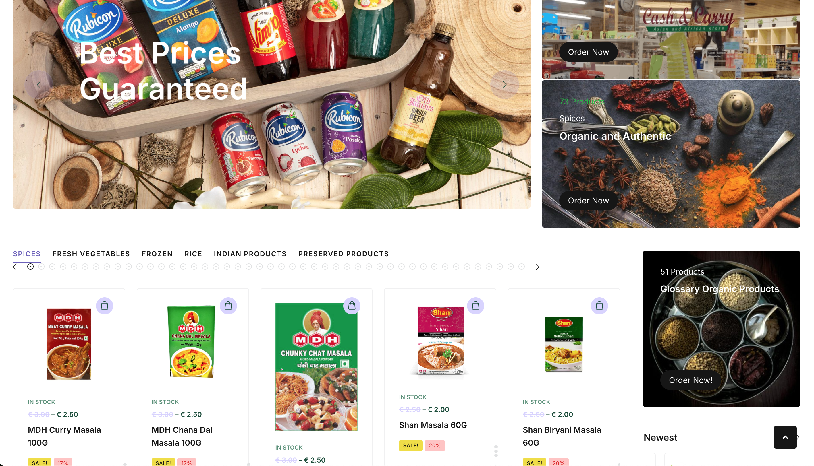
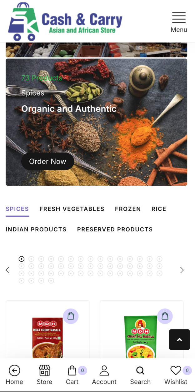
Category Navigation System
Top-level categories like Spices, Fresh Vegetables, Frozen, and Preserved Products are prominently surfaced for one-tap access.
Hero Promotions & Visual Merchandising
Large visual banners communicate product themes and active promotions while routing users to relevant catalog sections.
Product Grid With Quick Actions
Card layouts highlight stock state, pricing, sale labels, and direct cart actions for efficient browsing and buying.
App-Like Mobile Interface
Bottom navigation and touch-first spacing create a familiar experience for users shopping from their phones.
Screenshots & Features
Desktop View
Mobile View
Results & Impact
The finished experience positions Cash & Carry with a modern, scalable digital channel for grocery sales and promotions.
Mobile UX Score
Catalog Categories
Checkout Flow
Key Achievements
• Delivered a cohesive mobile-first grocery shopping flow
• Improved product discoverability through clear category structuring
• Balanced promotional storytelling with conversion-focused catalog interaction
• Created a reusable foundation for future category and campaign expansion
Why This Project Matters
Grocery e-commerce depends on speed, clarity, and trust. This project shows how a strong mobile UX and category-led information architecture can help shoppers find products faster and complete purchases with less friction.
Key Takeaways
Mobile-first design is critical for modern grocery shopping journeys
Category clarity drives faster product discovery and higher purchase intent
Promotions perform better when integrated into a clean navigation structure
App-like interaction patterns improve repeat usage and cart completion